︎ A creative merchandise and e-commerce agency ︎

ARCH 55
A fully bespoke and customisable typographic identity for Camden Town Brewery Arch 55 series.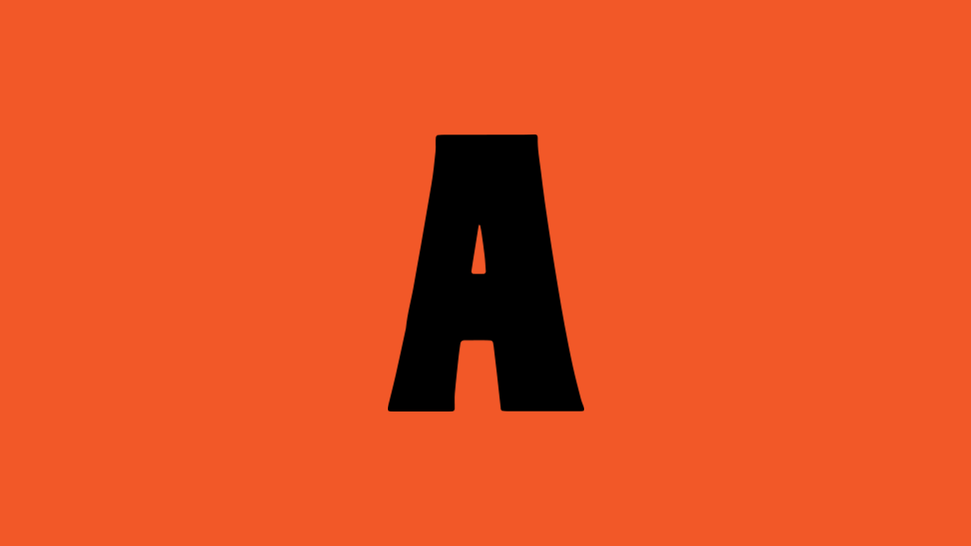
Client:
Camden Town Brewery
Camden Town Brewery
Sector:
Food & Drink
Discipline:
Typography
Branding
Credits:
Easy Days
Food & Drink
Discipline:
Typography
Branding
Credits:
Easy Days
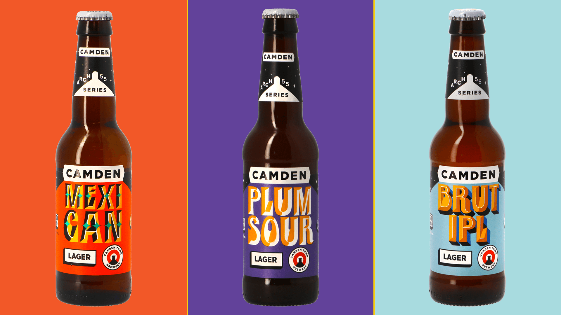
Camden Town Brewery's special Arch 55 series is home to some very experimental and extremely limited brews made at their spiritual Wilkin St. Mews brewery.
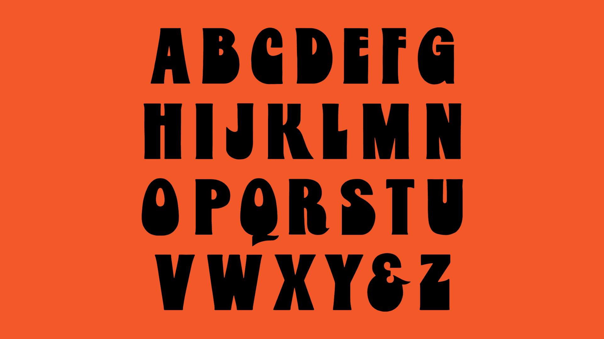
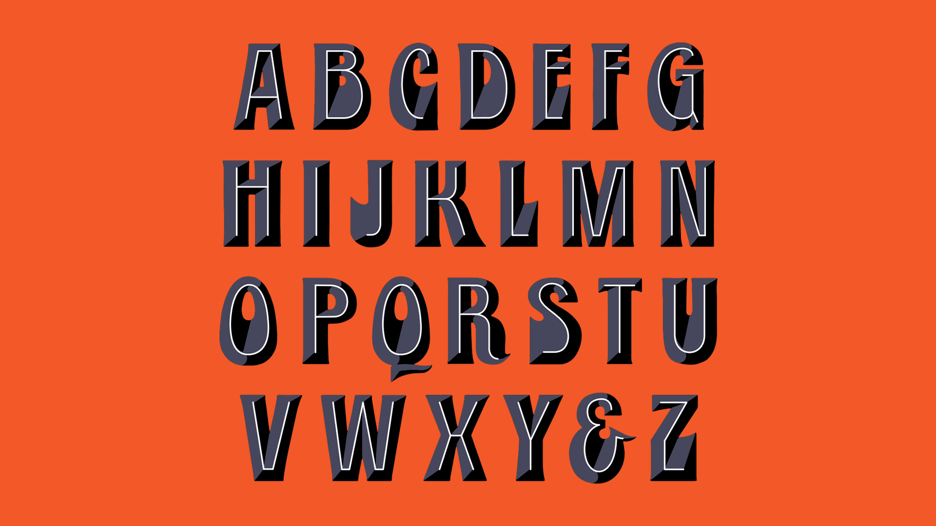
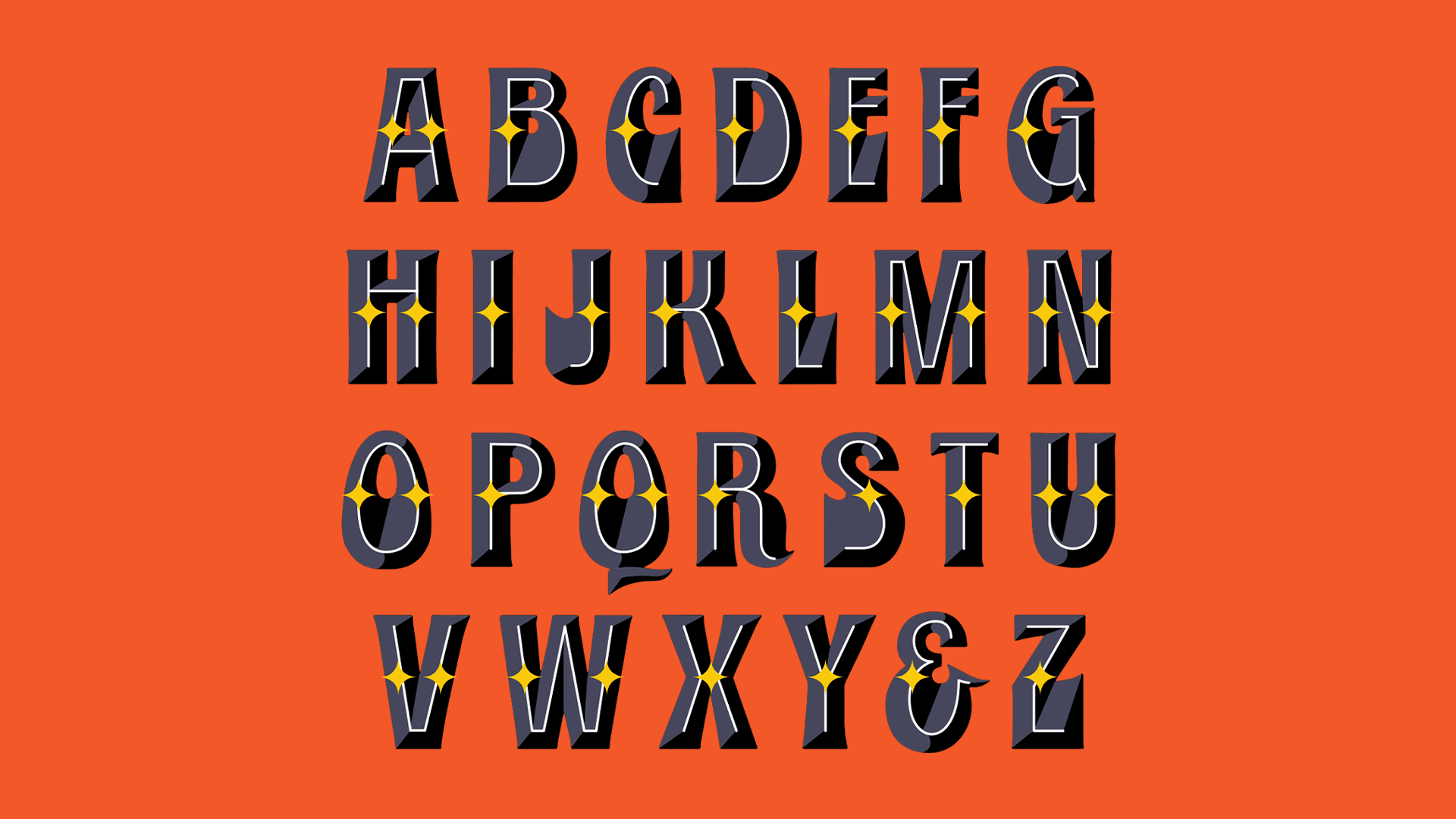
CTB came to us in need of some fresh ideas for labels, for these special brews. We designed a dynamic typeface that was developed from a hand-drawn alphabet, and then given multiple layers and colour palettes. From the one font, there are over 36 possible type variations, add in colour, and the possibilities are endless. We supplied this to Camden’s in-house design team so they could be as reactive as possible with the design for the brews, and keep an element of consistency going forward.
CTB came to us in need of some fresh ideas for labels, for these special brews. We designed a dynamic typeface that was developed from a hand-drawn alphabet, and then given multiple layers and colour palettes. From the one font, there are over 36 possible type variations, add in colour, and the possibilities are endless. We supplied this to Camden’s in-house design team so they could be as reactive as possible with the design for the brews, and keep an element of consistency going forward.
“THERE ARE OVER 36 POSSIBLE TYPE VARIATIONS, ADD IN COLOUR, AND THE POSSIBILITIES ARE ENDLESS.”
Type Variations: